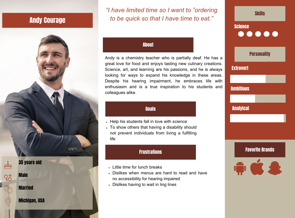
Indulge Bakery App

Below is a course project that I completed for my career certificate.

Indulge

The Challenge

A local bakery aims to create a mobile application to enhance its aesthetics and streamline the ordering and checkout procedures. The proposed design will include the addition of group ordering functionality to accommodate multiple customers ordering together.

The Goal

In order to increase customer reach the bakery would like to have a mobile app that also allows order oick up.

I'm designing an app for a bakery that also simplifies making large/group orders. It eliminates the hassle of waiting in line and going through the payment process for each individual order. This helps customers save time and effort by placing group orders with ease. With our innovative app, customers can quickly place their orders, skip the queue, and pick them up at their convenience. We're excited to introduce this feature to busy customers looking to streamline their bakery experience.

  • Role: UX Researcher, UX/UI Designer, Graphic Designer, Interaction Designer
  • Tools: Figma, Photoshop
The Process

Info Gathering / Research

  • Analyze Competition
  • Define features

User Stories

  • Personas
  • User Flow

Wireframes and prototype

  • Lofi Wireframes
  • Low Fidelity Prototype

Design/ branding concepts

  • UI Kit
  • Final Design

Competitive Research

After a thorough analysis of the food ordering app market, I identified areas of opportunity for our app to become more competitive. By examining the successes and failures of current apps, we can make strategic improvements to ensure a better user experience for our customers.

User Personas

Through competition analysis and surveys of the targeted demographic, I have gathered insights on their behaviors when ordering food online from mobile devices. Based on the interviews, I have categorized their responses into two groups: what my app should focus on pursuing and what it should avoid. This information will be invaluable in developing an app that meets the needs and preferences of our target audience, and helps us differentiate our offering from competitors.

User Flow

To ensure a user-friendly experience on the food ordering app, I first created a user flow chart. This flow was informed by empathy research on the targeted demographic's typical behavior when browsing food ordering sites. The user flow helps guide users to easily find and select the type of food they are interested in ordering, ultimately leading to a smoother and more enjoyable experience.

User Flow Chart

Wire frames

I created rough draft low fidelity wireframes for the app based on the user flows. These wireframes outline the structure and layout of the app's screens and functionality, while keeping the design simple and user-friendly. The wireframes will serve as a guide to the development team to bring the app to life in a visually appealing and functional way.

View Lo-fi Prototype

ype

Usability Study

To ensure an optimal user experience, an unmoderated usability study was conducted on lo-fi wireframes to identify any potential weaknesses in the app's design. 4 participants took part. The results showed that 3 of the testers expected to see a confirmation page after placing an order, and 1 user had difficulty pressing buttons due to small icons. The study provided valuable insights into user expectations and issues with the prototype, helping to determine which improvements to prioritize moving forward.

Notable Findings

The research interviews revealed that users experienced frustration when adding invitees for collaborative orders. Furthermore, users expected to see a confirmation page after completing their orders, and some found the app icons too small and difficult to use. These insights can be used to improve the user experience and make the process smoother for users.

Design

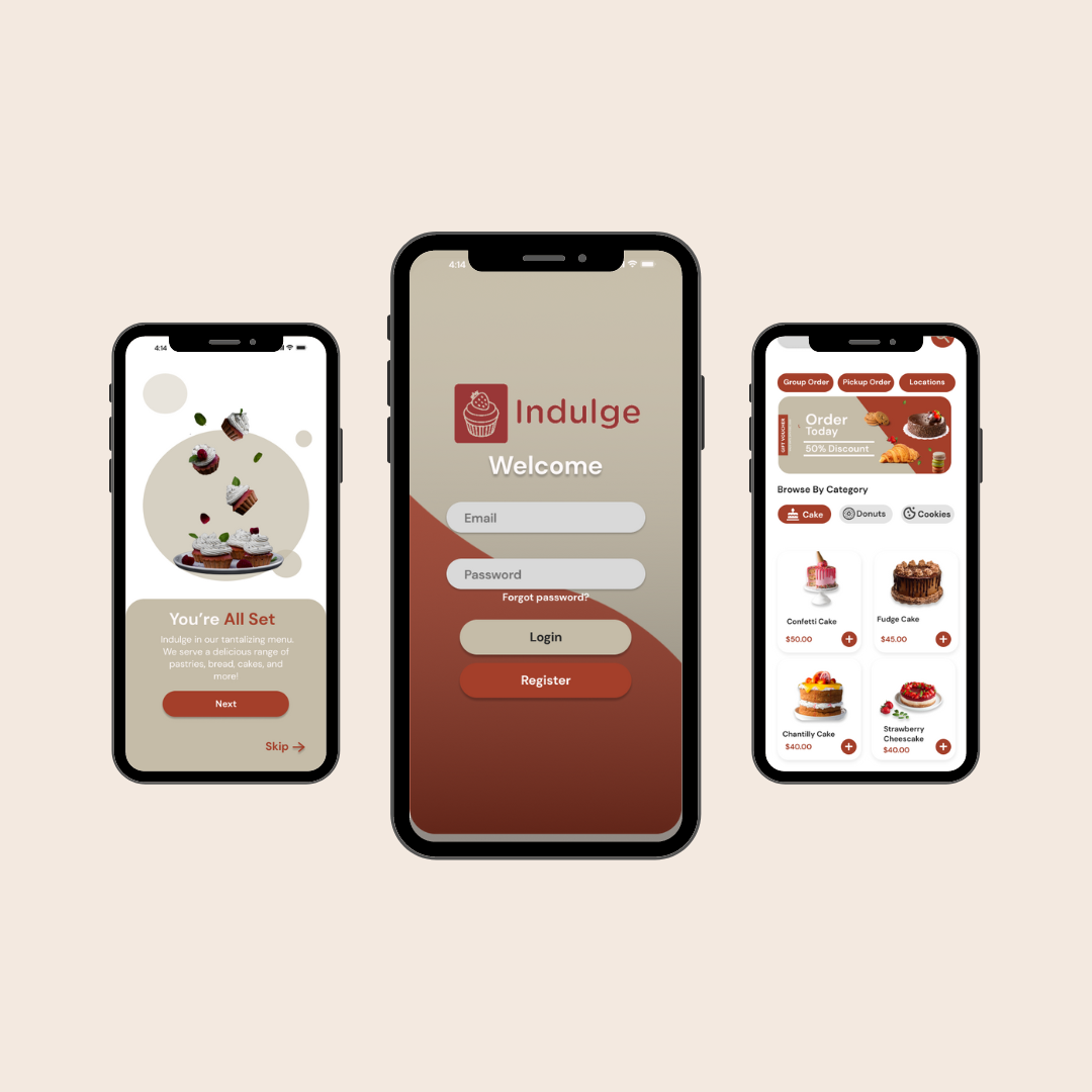
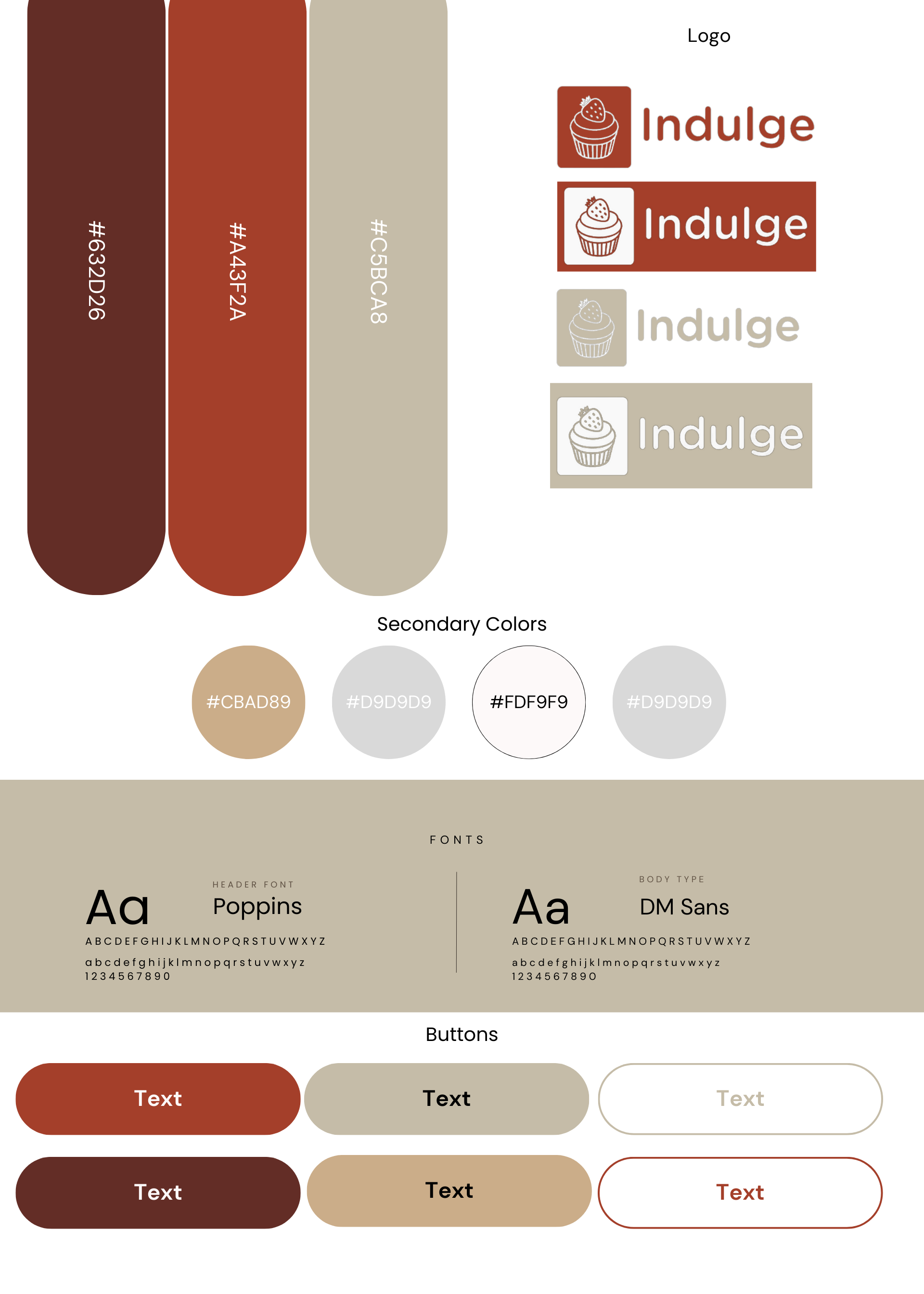
Brand identity: To establish the bakery app's visual identity, a warm and welcoming mood was selected. Neutral, brown and red colors were chosen to complement the app's theme. This gave the app a cozy atmosphere, inviting users to explore and discover baked treats. The signature identity was essential in setting the tone for future prototype development. By establishing the app's visual identity from the beginning, all design elements moving forward could be refined to align with the established brand. Overall, the signature identity successfully conveyed the desired mood, and the bakery app is set to move forward with a clear, cohesive design strategy.

Style Guide

Accessibility:

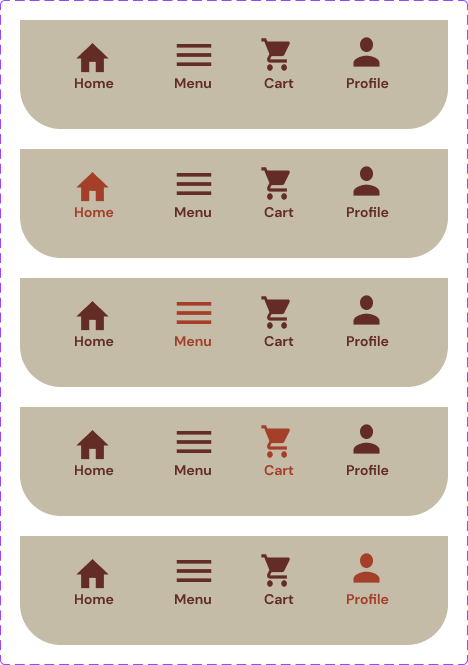
I utilized the Gestalt principles for my designs, taking into consideration scaling and color to emphasize the importance of items. In working order, ideally these would be defined by H1, H2 headings once coded.

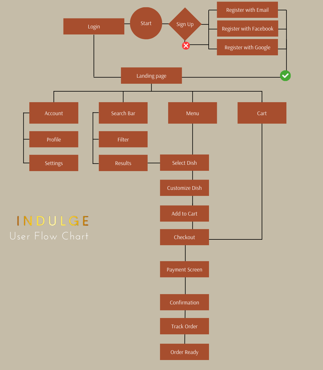
Menu: Links and buttons will change color, active links will be highlighted to indicate which page is currently selected.

accessible menubar image

The Final Result

Mobile application final look

View Hi-fi Prototype

Final Thoughts

The potential: Research reflects that retailers implementing mobile apps expands their customer reach by up to 75%. On average 49 percent of users use mobile apps for retail services. This could be very useful for a brick and mortar retail store interested in expanding their visibility.

Reflection: Designing an app involves continuous testing and changes to improve the user experience. Feedback from user testing helps to shape and update the design, which is never truly finished and constantly evolving. This iterative process ensures that the app remains user-focused and caters to the needs of the target audience. A successful app should always strive to keep up with changing user trends and preferences to provide the best possible user experience.