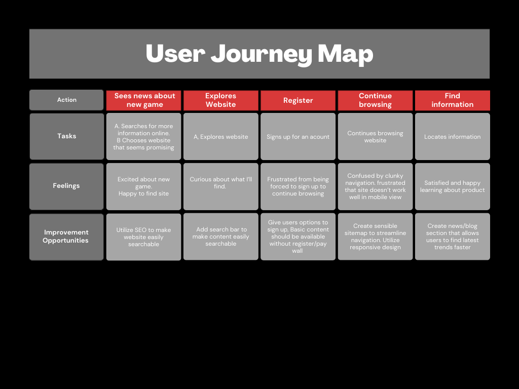
GameVault

Below is a design for responsive website

GameVault

The Challenge

The client faces a daunting challenge of maintaining both a website and an app, which is not only time-consuming but also resource-intensive. They want to eliminate this need and streamline their digital presence with a scalable website that adapts to different screen sizes.

The Goal

The solution lies in designing a dynamic website that is responsive and user-friendly across devices and platforms. This approach will not only simplify their operations but also enhance their brand visibility and engagement by catering to a wider audience.

  • Role: UX Researcher, UX/UI Designer
  • Tools: Pen and paper, Figma, Photoshop, Dreamweaver
The Process

Info Gathering / Research

  • Analyze Competition
  • Define User Needs and Pain Points

User Stories

  • Personas
  • Sitemap

Wireframes and prototype

  • Lofi Wireframes
  • Low Fidelity Prototype

Design/ branding concepts

  • UI Kit
  • Final Design

Competitive Research

Through my market research, I analyzed the content of gaming websites such as IGN, GameRant, and GameSpot. My findings unveiled diverse categories for games, game reviews, and gaming news. Each site offers a unique perspective on the gaming industry with a vast array of content. By studying these popular websites, I was able to gain valuable insight into the latest trends and news in the gaming industry. I analyzed their strong points, weaknesses and gaged opportunities in which I could exploit for improvement of my own designs.

Journey Map

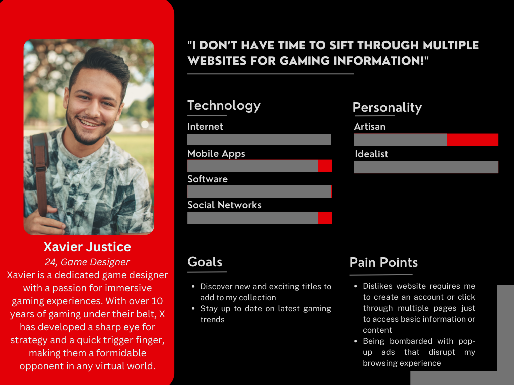
To fully grasp the requirements and inclinations of the users I was designing for, I conducted user interviews and crafted journey maps to illustrate their habits. Through this process, it became evident that a significant portion of our user base consisted of individuals of different ages who either played video games or had an interest in keeping up with technological advancements.

Through user interviews, I discovered that many individuals found it frustrating when websites pushed them to register an account after only allowing limited access to information. This process results in a negative user experience, as many individuals are more likely to seek information elsewhere. Additionally, mobile users often encountered technical difficulties when attempting to use some websites, causing further frustration and inconvenience. Overall, these issues highlighted the importance of efficient and user-friendly website design for optimal functionality and user satisfaction.

User Journey Map

User Personas

After conducting extensive research, I developed a user persona that accurately represents the characteristics and behaviors of our target audience.

User Persona

Site Map and Information Architecture

With my expertise in web design, I created a highly effective sitemap that allowed users to quickly and easily locate the exact content they were seeking. By carefully organizing the website's information architecture, I ensured that visitors were able to seamlessly navigate to their desired pages with minimal clicks. The result was a significantly improved user experience, where visitors felt empowered and confident in their ability to find the information they needed. My sitemap design was an essential component in achieving the overall success of the website and maximizing its impact.

Wire frames

From my sitemap I crafted wireframes for the website that outlined the structure for both desktop and mobile view.

Wireframe Sketch

View Lo-fi Prototype

ype

Usability Study

During my usability study, I conducted the first round of testing and discovered several pain points for users. In the mobile view, users were unhappy with the location of the login button. Additionally, the image alignments were off, making it difficult for users to navigate. The text on the hero image was also hard to read, hindering the overall experience. These issues need to be addressed in order to improve the user experience and ensure that the website is functioning smoothly. I immediately set to work on making improvements.

Design: Brand identity

To ensure the client's satisfaction with the website's design, I created a detailed design guide that adhered to their brand guidelines. My main focus was to maintain consistency across all webpages while incorporating creative elements that would enhance the overall look and feel of the site as well as adhere to WCAG standards. The design guide included specific color palettes, typography choices, and image guidelines. With this guide in place, I was able to successfully create a visually appealing website that authentically represented the client's brand.

The End Product

View Hi-fi Prototype

Takeaways

Because there are screens of varying sizes and there is no set standard for screen size it is not possible to design a responsive site that's perfect for ALL modes of digital display but I did my best to make the site accessible for a lot of users. As technology continues to evolve I will continue to keep up with my many iterations of the site.